From 'ask a local' to 'search and go' — redesigning Algoa Bus's digital experience.
Redesigning the digital experience of Port Elizabeth's public bus system by replacing uncertainty with clarity.
2025
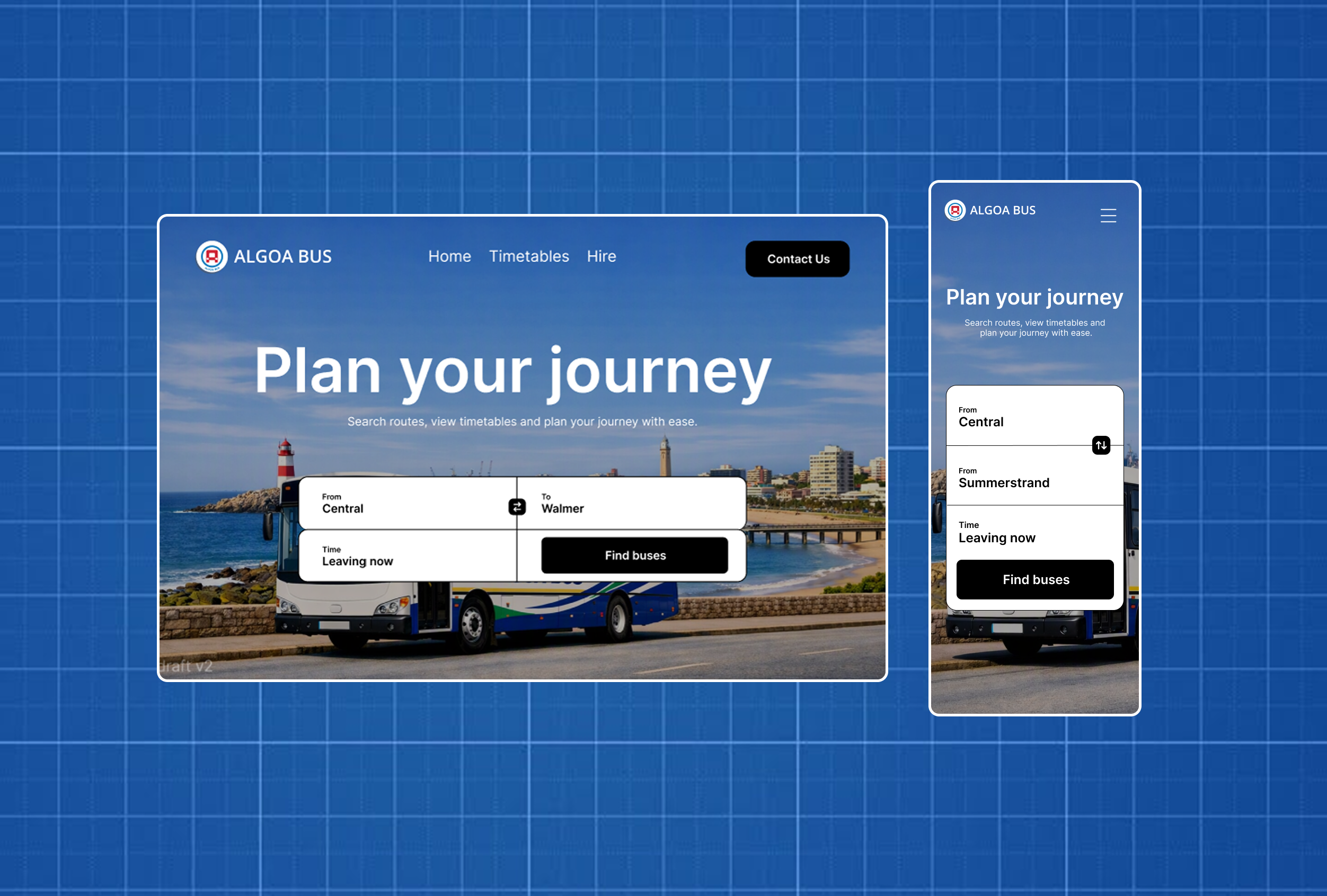
- Role
Self-directed UX/UI redesign + frontend development
- Type
Speculative case study
- Timeline
5 months
- Tools
Figma, Next.js
- Responsibilities
- User Research
- Wireframing
- UI design
- Development
- Outcome
Live journey-planner prototype focused on search, routes, times & fares
- Overview
This case study explores the redesign of the Algoa Bus website, a public transport service that plays a vital role in helping people travel across Port Elizabeth (Gqeberha). The project was driven by a simple challenge: while the buses are widely used, finding reliable information about routes, schedules, and fares online is unnecessarily difficult. Through user research and a mobile-first UX approach, the redesign creates a clearer, more intuitive journey-planning experience for commuters, making public transport easier to understand and more accessible for both existing and first-time users.
The Problem
A site that promotes a service it no longer has.
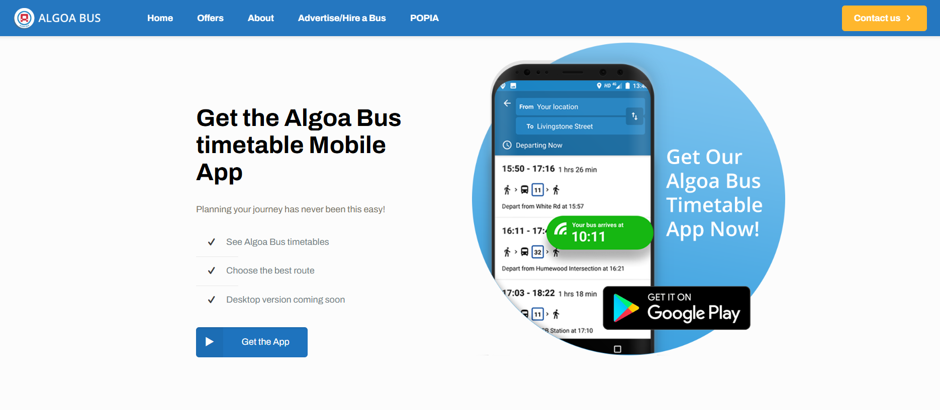
The live site still lists a "timetable mobile app" as a core offer — it was discontinued.
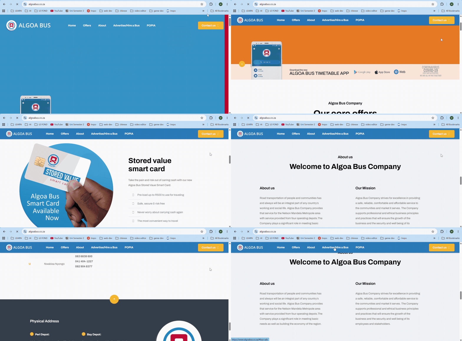
Trying to find times, fares, or routes on the current site. The experience is confusing and frustrating.
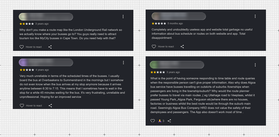
Real commuter feedback — names redacted.
- 1
Outdated information.
The site lists a discontinued mobile app and old timetables, which misleads users.
- 2
No schedules, fares, routes data.
The site doesn't clearly communicate when buses run, how much they cost, or where they go.
- 3
Poor mobile experience.
The website isn't optimized for commuters accessing information on their phones.
The Solution
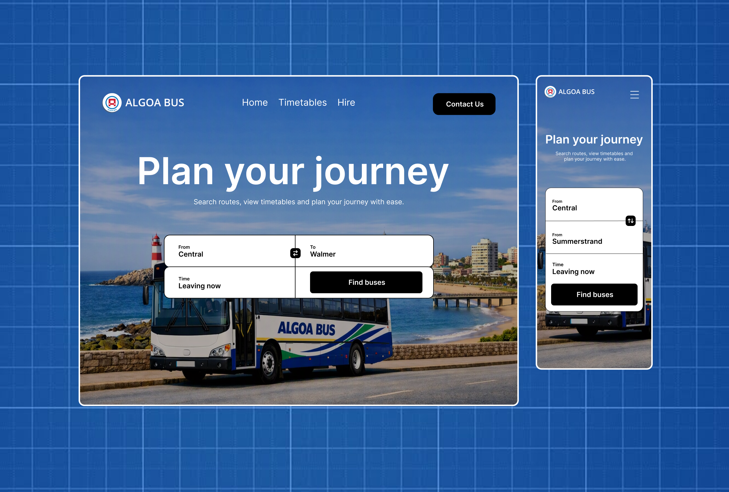
A trip planner that actually answers where, when, and how much.
Search replaces browsing.
A simple search bar lets users enter their starting point and destination instead of manually browsing routes.
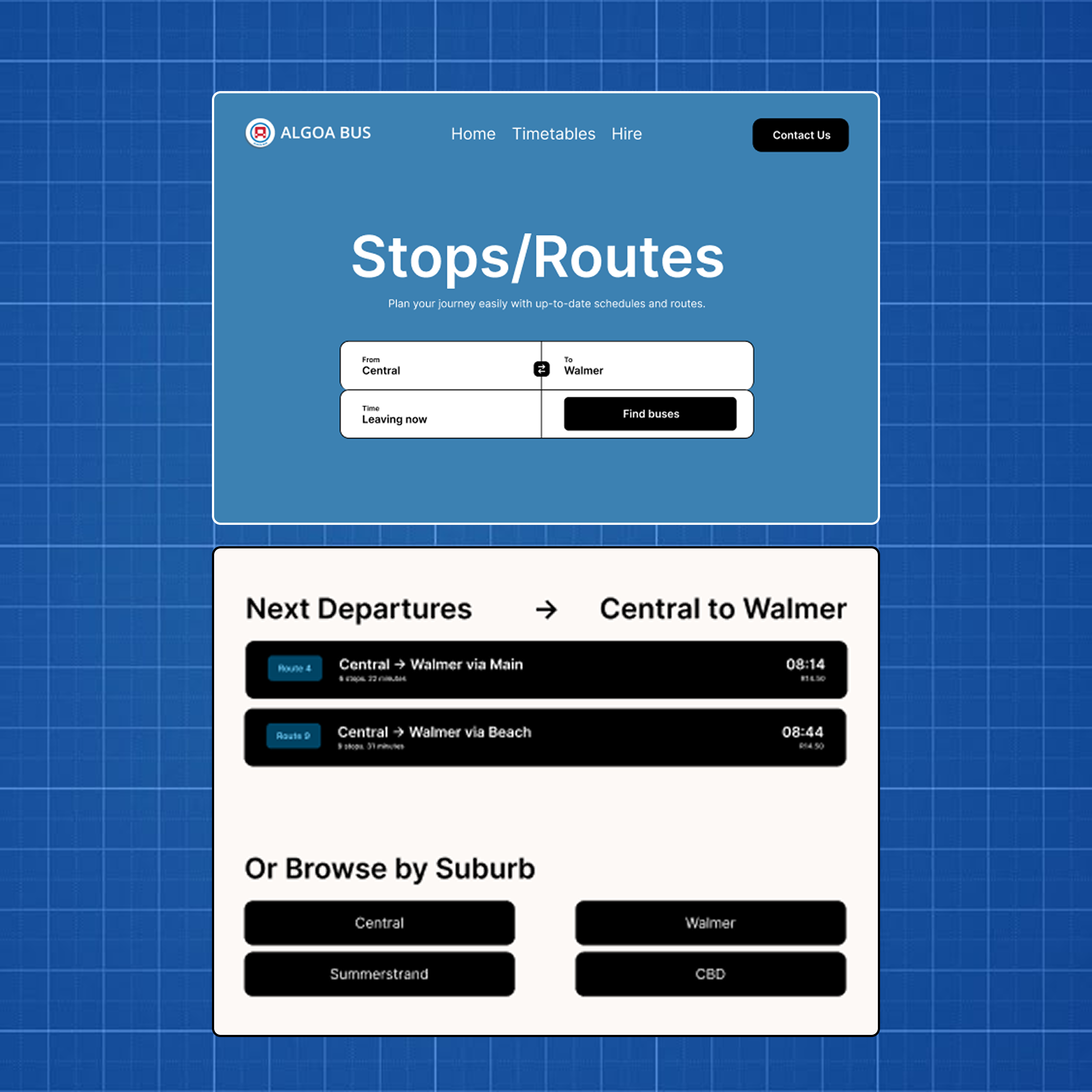
One screen, every answer.
Times, fares, and routes surface together on the results screen.
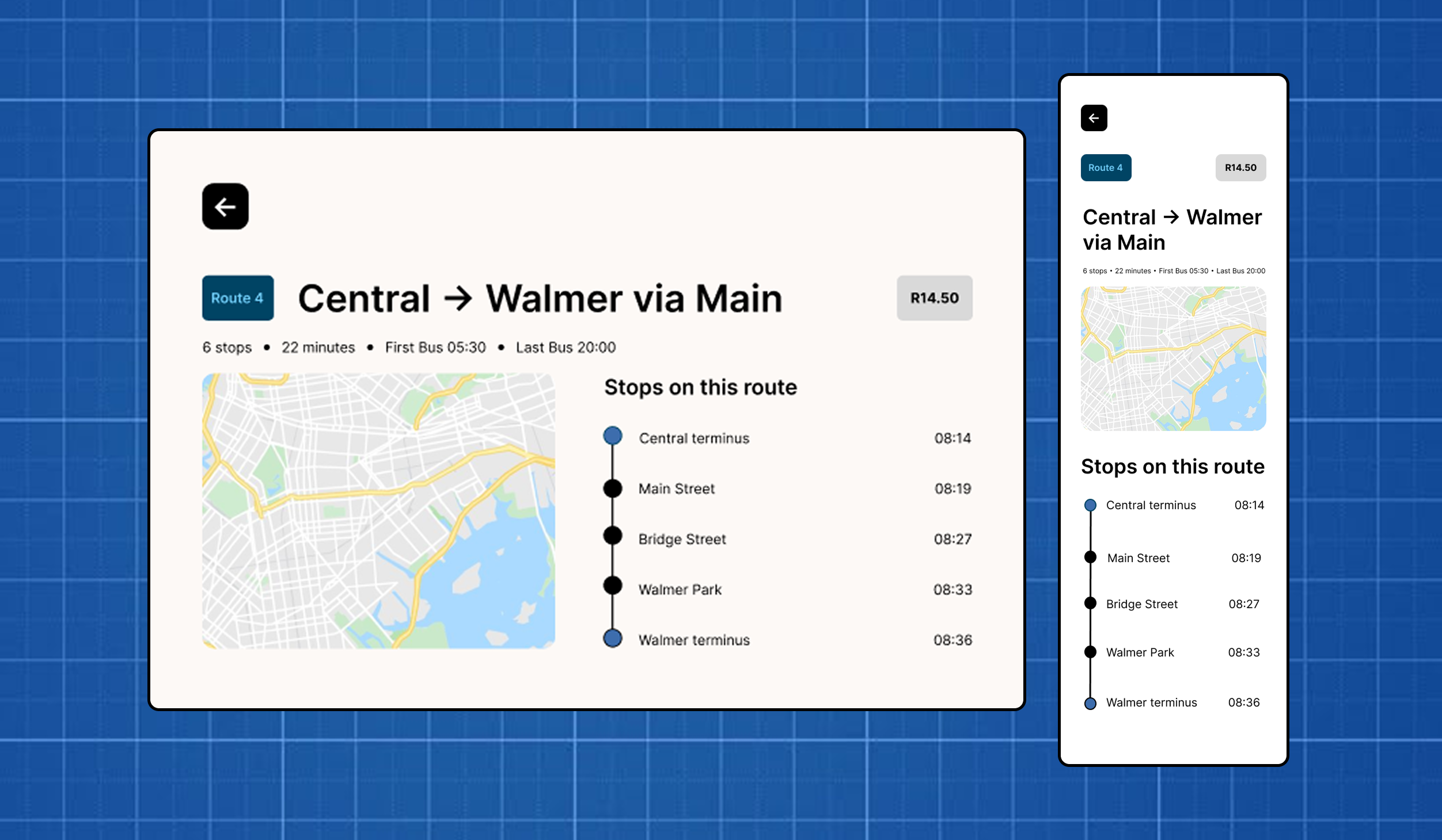
The full route, step by step.
A stop-by-stop timeline shows exactly where the bus goes.
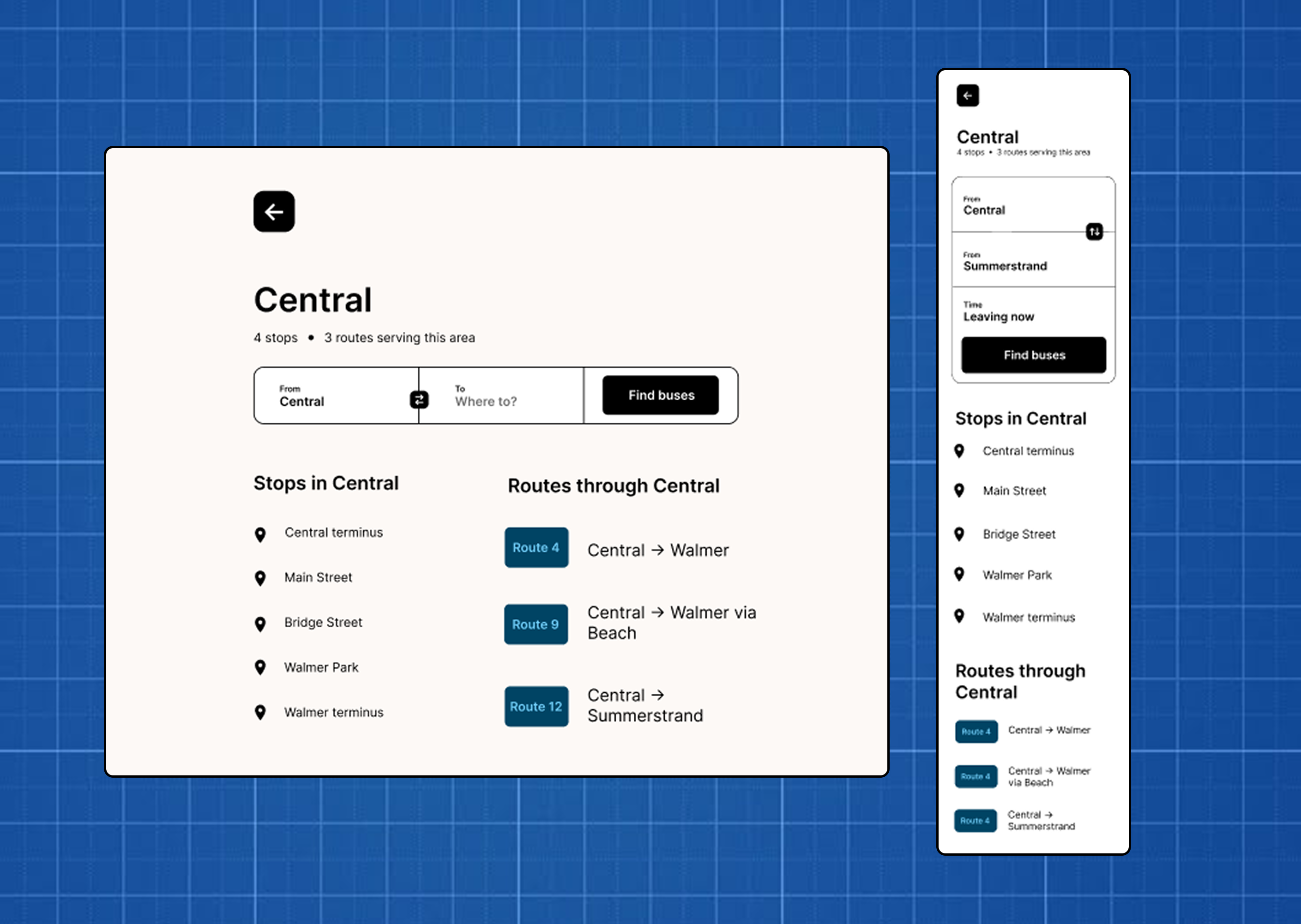
Browse by suburb or stop.
Users can also explore routes by suburb or bus stop if they prefer to browse instead of search.
Research Summary
I combined competitor analysis, commuter interviews, and personal experience to uncover the biggest barriers preventing people from confidently using Algoa Bus.
Market Insights & Competitor Analysis
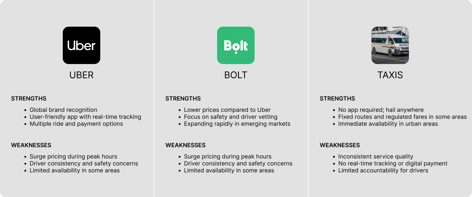
I analyzed transport services like Uber, Bolt, Google Maps, and MyCiTi to understand how clear information and simple navigation improve the travel experience.
Personal Experience
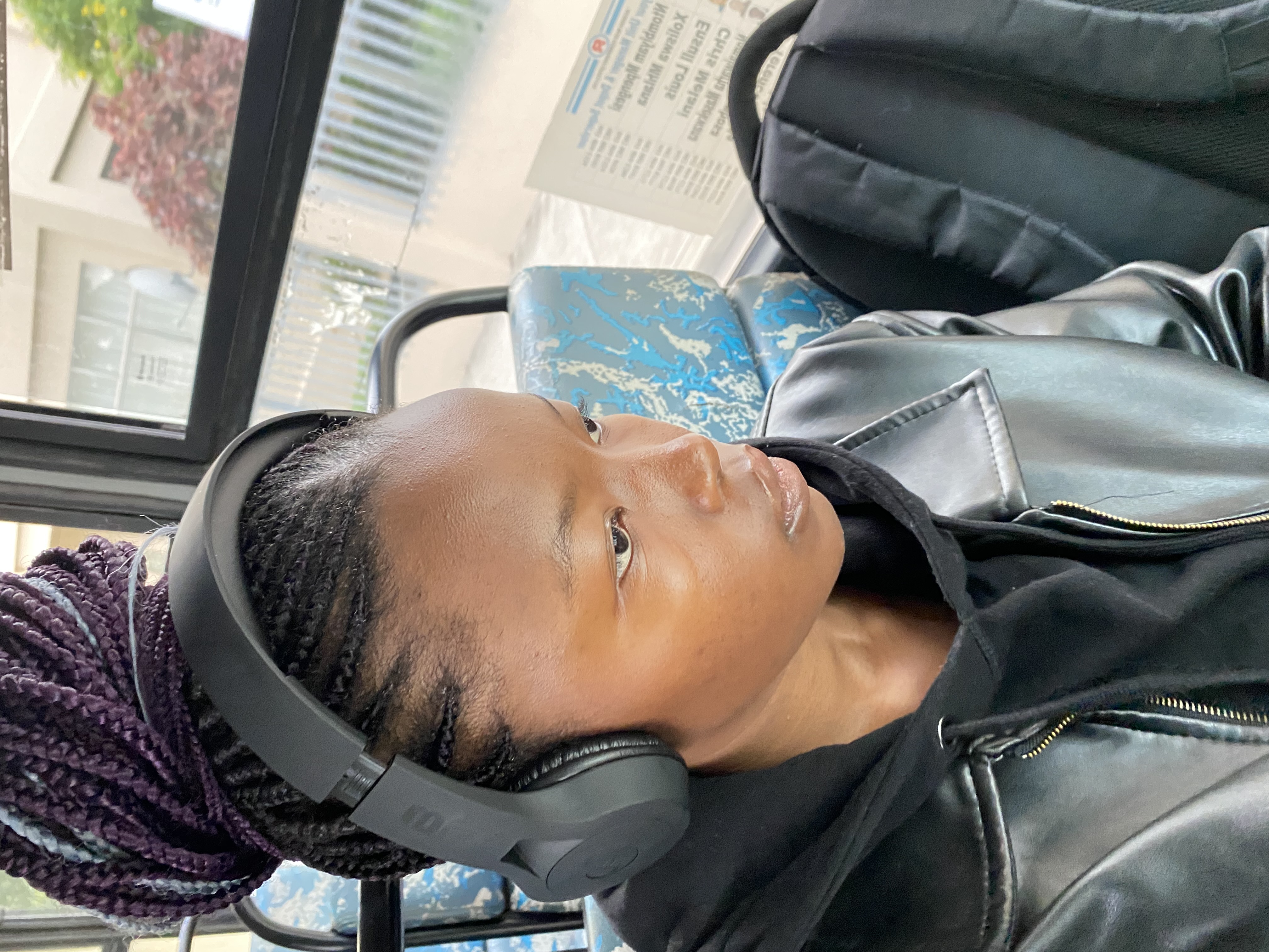
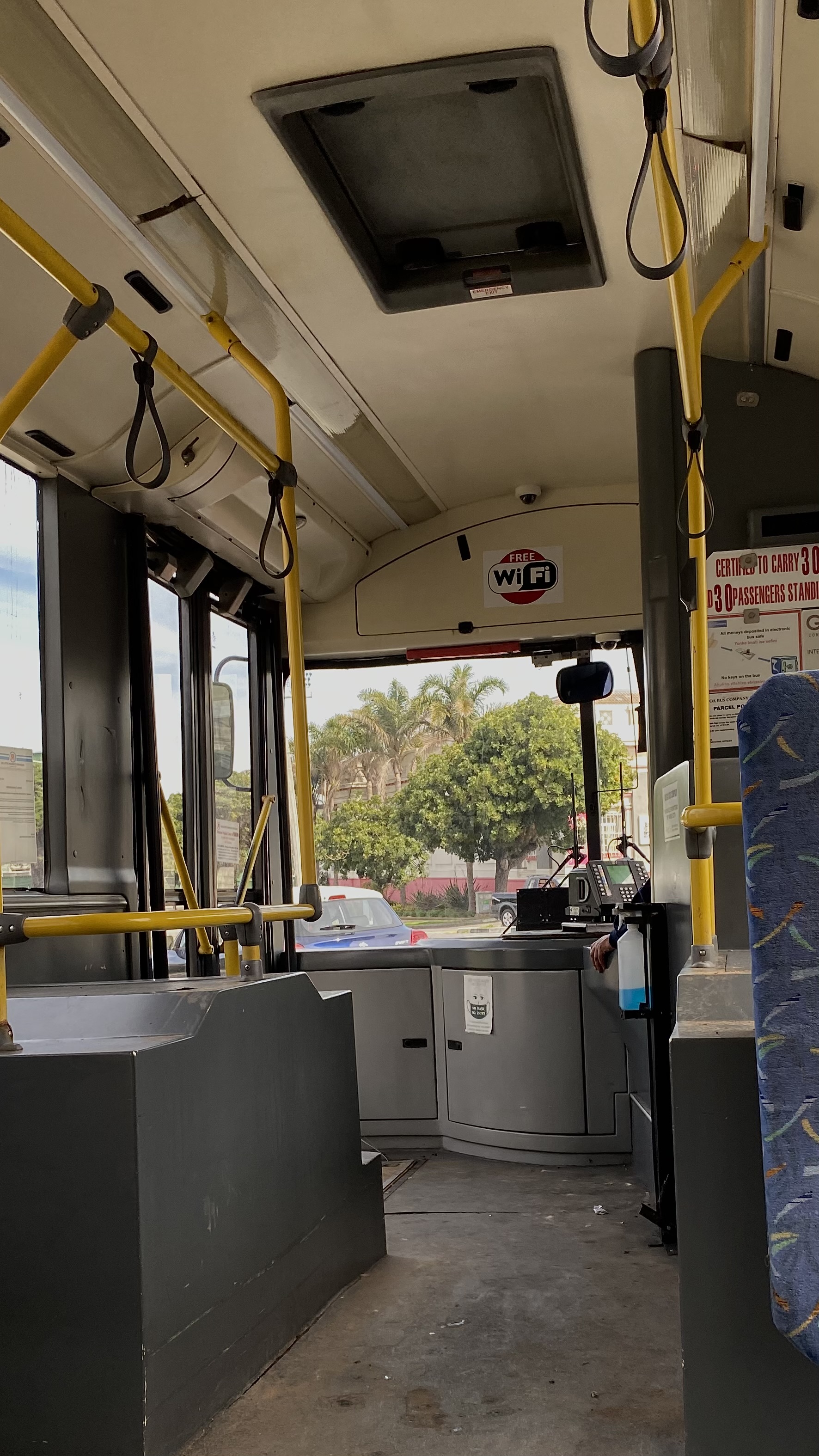
I've used Algoa Bus myself for years — it got me to school reliably and cheaply, and I trusted it for that one route. But I never knew what else it could do for me. I didn't know the other routes, the stops, the fares, or the times for anywhere beyond my daily trip. When friends found out I used the bus, they'd ask me about routes to other parts of town, and I never had an answer.
I was curious about exploring other routes, but never confident enough to actually try — calling the depot to ask felt like more effort than it was worth, and getting it wrong meant being stranded somewhere unfamiliar. So for anything outside my one known route, I defaulted to a taxi or an Uber instead, even though the bus would've been cheaper.
That gap — trusting the bus for one specific trip but avoiding it for everything else — is really what started this project.
Usability Interviews
I conducted 1-on-1 interviews with 3 daily commuters in Gqeberha to learn how they plan journeys and why many avoid using Algoa Bus for unfamiliar destinations.
- 1
Finding the right bus depended more on local knowledge than the official website.
- 2
A simple start-to-destination search emerged as the most valuable feature for reducing travel uncertainty.
User Personas
Based on real user research, this persona highlights the motivations and pain points that shaped the redesign of the Algoa Bus experience.
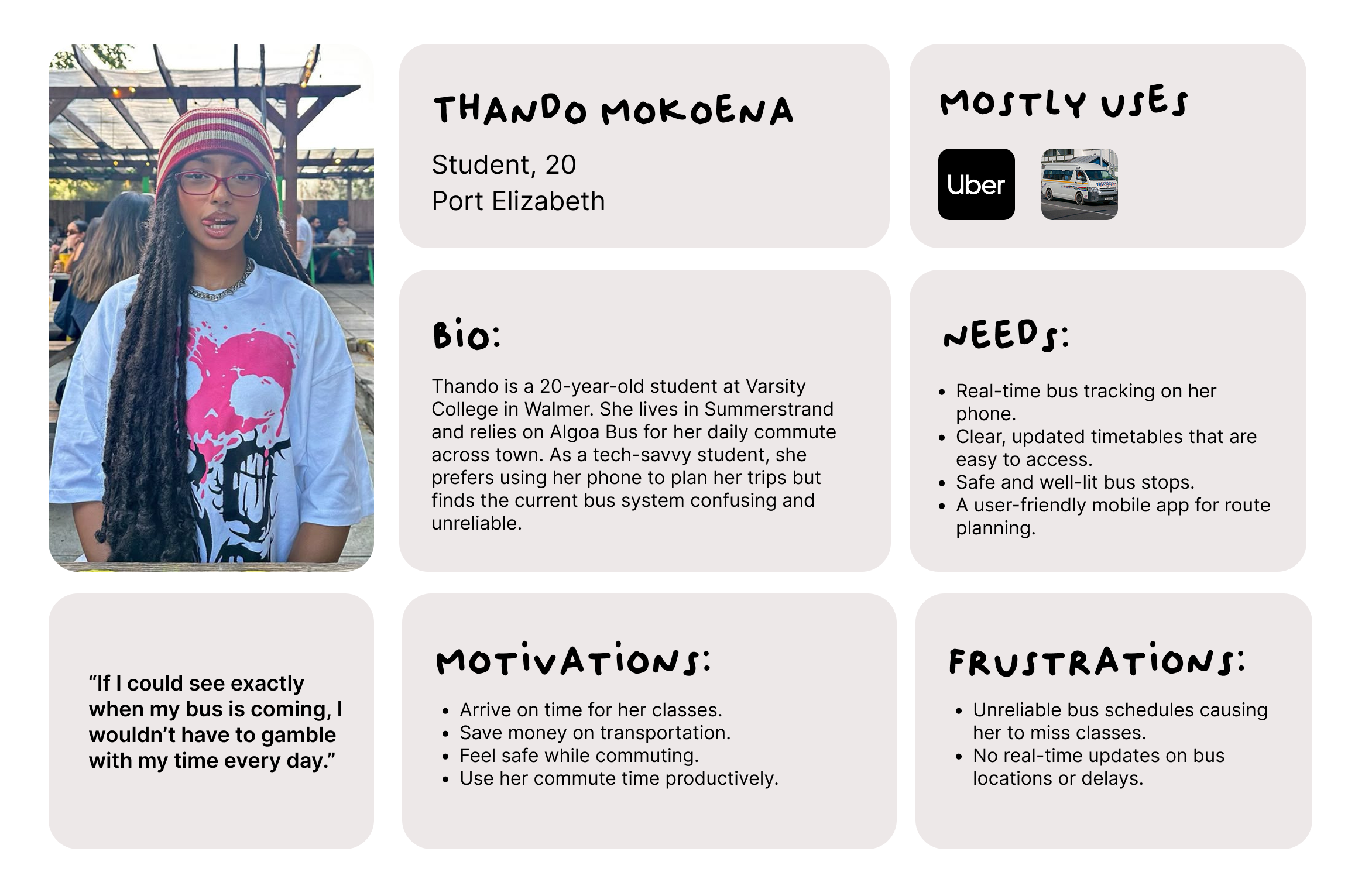
Design OutcomeThando's biggest frustration was not knowing when her bus would arrive, calling it ‘gambling with my time.’ To close that gap, the redesign surfaces route, time, and fare together on one results screen — giving her a clear answer before she leaves home instead of relying on guesswork.
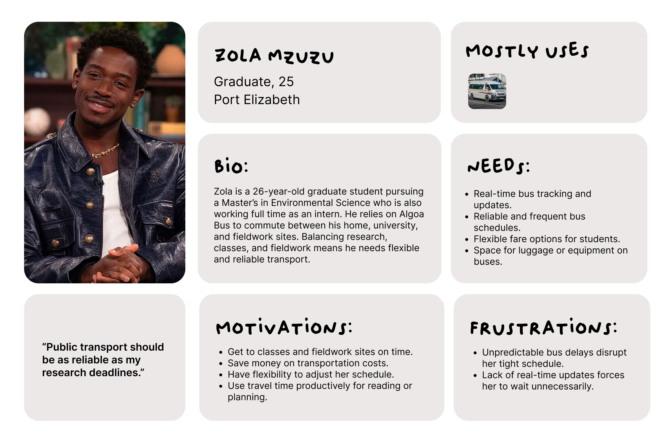
Design OutcomeZola needs flexible, reliable transport across several destinations — home, campus, and fieldwork sites — not just one familiar trip. The search-based journey planner and stop-by-stop timeline let him confidently plan any route on demand, rather than defaulting to the one route he already knows.
Design Process
Wireframing
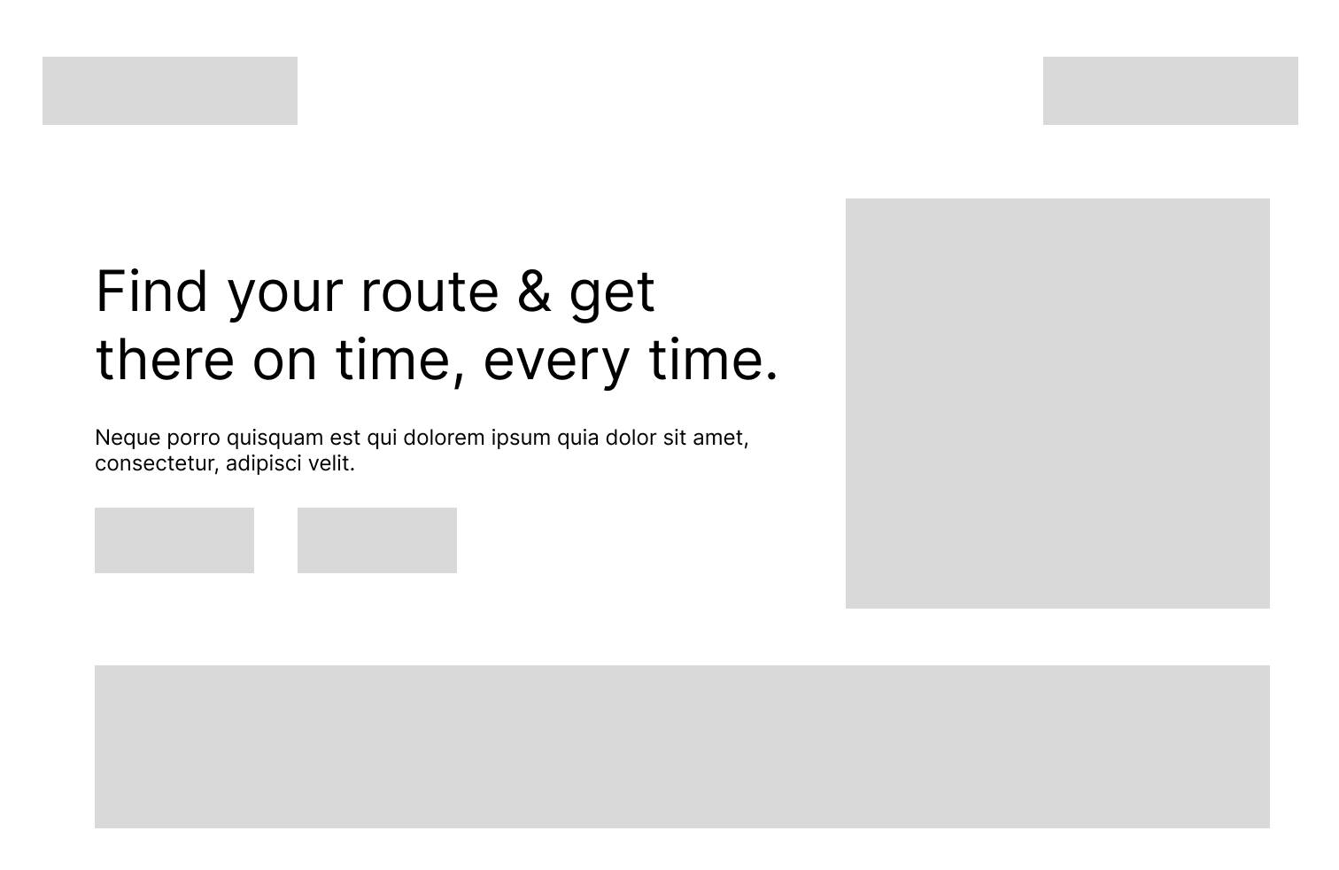
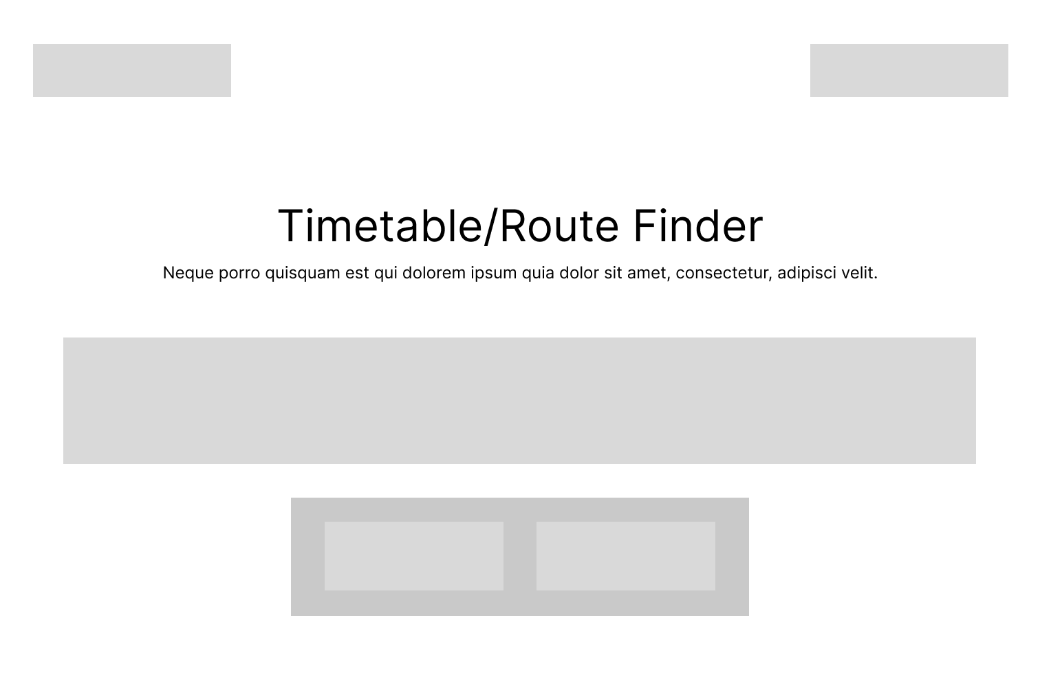
I focused on designing a journey planner that lets users search their starting point and destination instead of manually browsing routes.
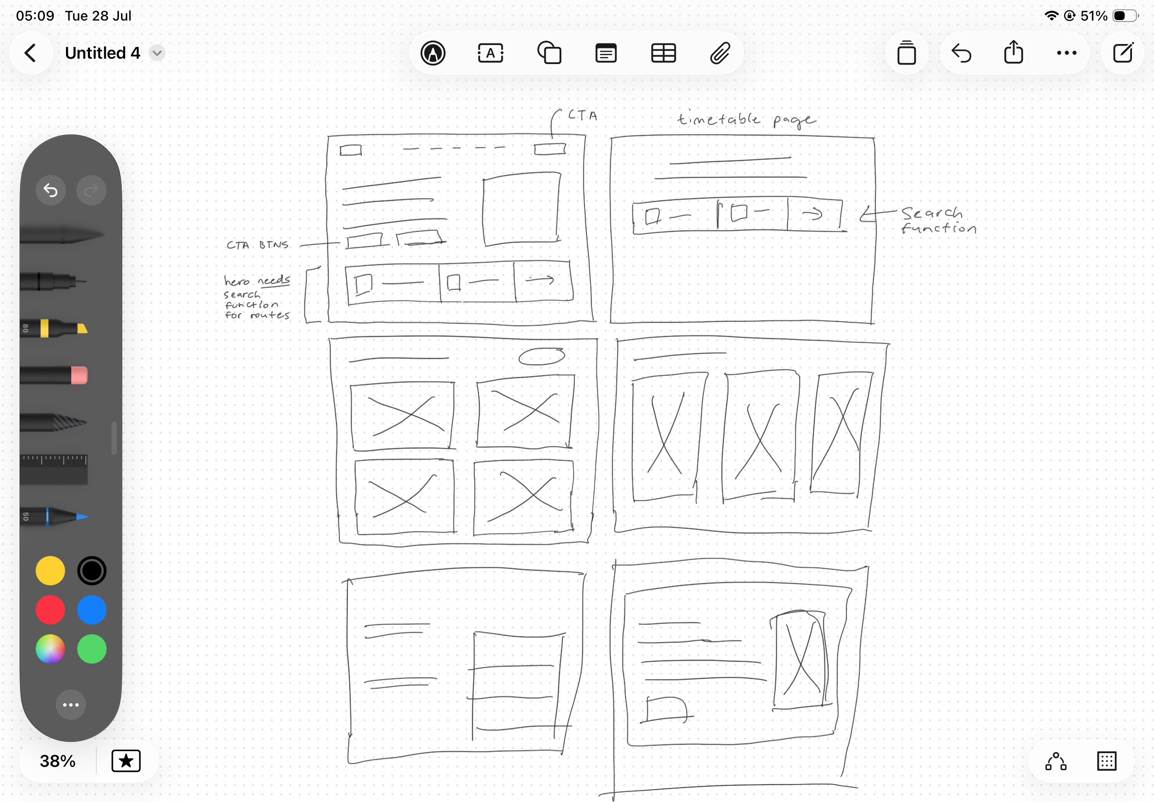
Low-Fidelity
Explorations
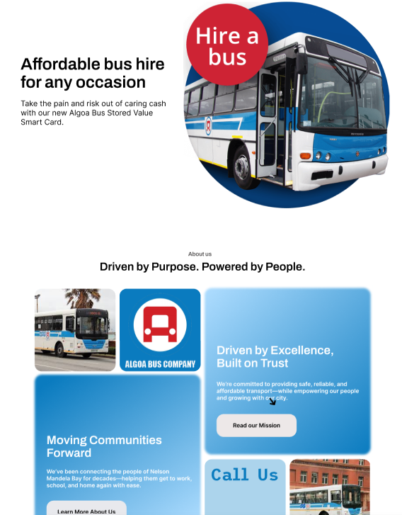
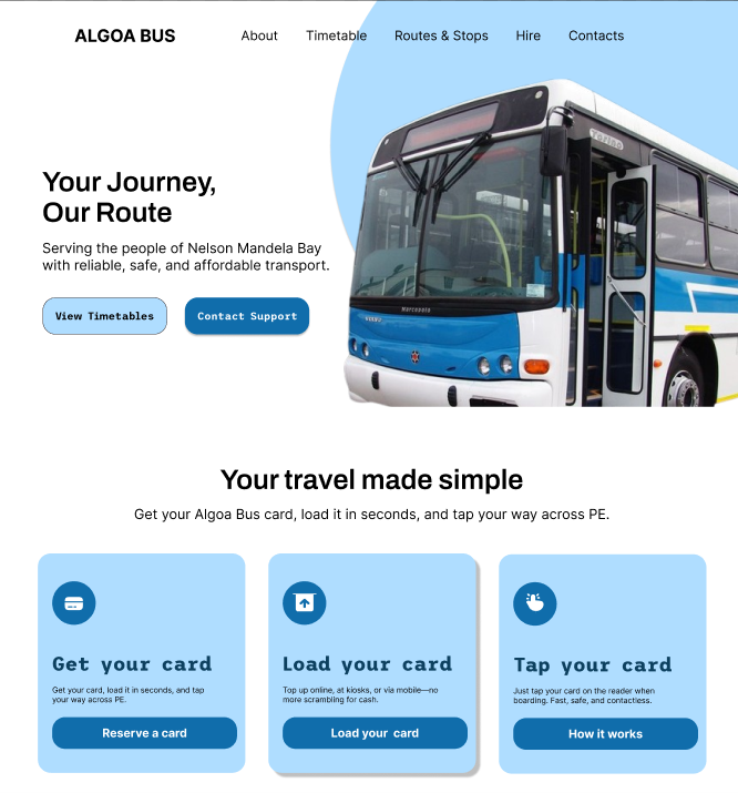
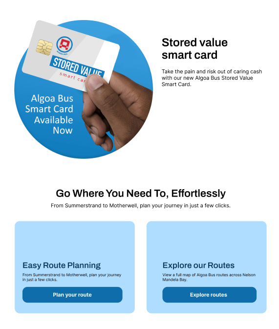
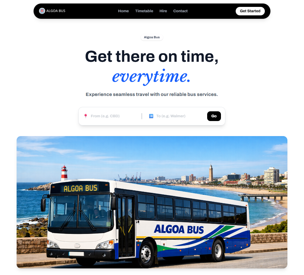
Before settling on the final homepage, I explored four different directions with fellow UI/UX designers to see which one actually got a commuter to their route fastest. Some leaned into brand storytelling and the bus-hire service, others led with the smart card and payment flow, and one buried route planning a click behind a 'Plan your route' card. The direction that won puts a working From/To search bar directly in the hero — no extra navigation required — because it was the only version that matched what research showed commuters actually needed first: a way to search their trip immediately, not browse the brand.
Annotated Final Screens
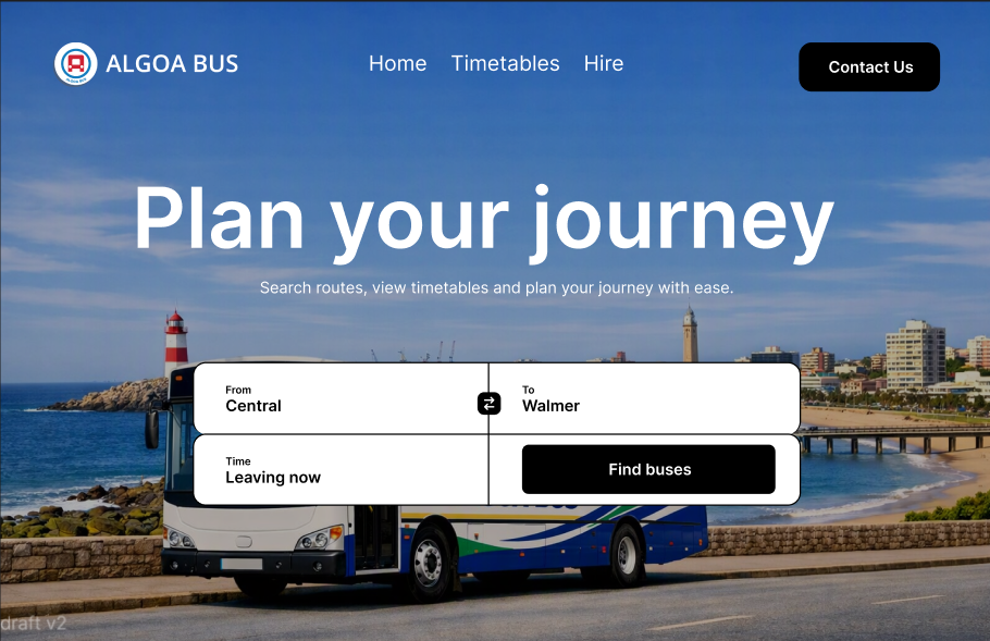
Search-first, not browse-first
Research showed commuters had no way to search a specific trip — they relied on word-of-mouth or a call to the depot instead. The final home screen leads with a working From/To search bar rather than a list of routes to browse, because search matches how a commuter actually thinks about a trip: 'I need to get from A to B,' not 'which route number is that.'
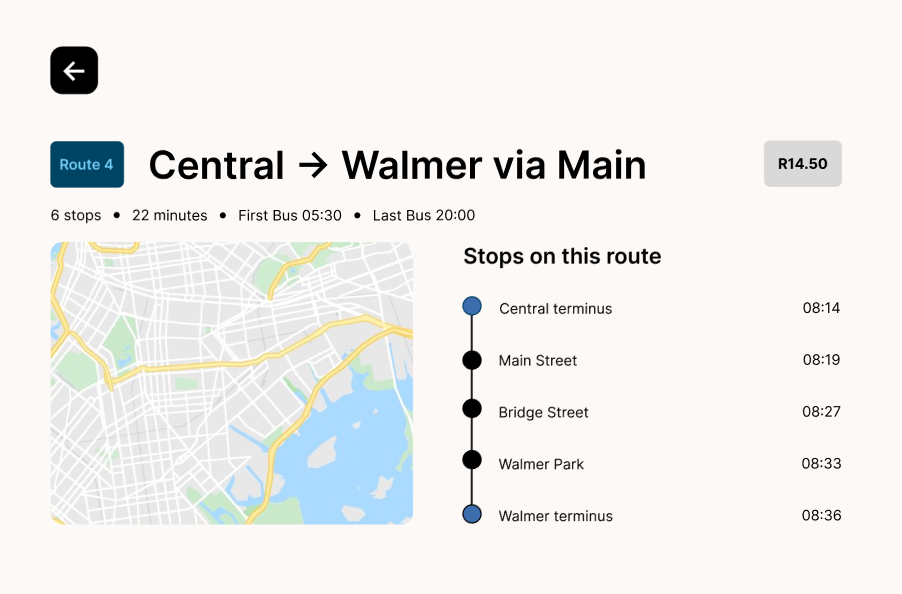
A stop-by-stop timeline, not a static list
Once a route is selected, results show a dotted timeline connecting each stop to its scheduled time, instead of a plain list. This lets a rider — especially a first-time one — see at a glance how far into the trip they are and what's still ahead, giving them the same mental map of the route that a daily commuter already has for the one route they trust.
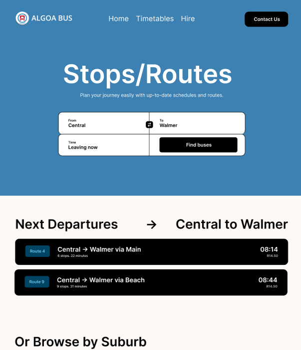
Browsing stays a fallback, not the front door
Browsing by suburb is still available for commuters who don't yet know exactly where they're going, but it sits beneath the search results rather than replacing them. Making search the default and browsing the fallback — instead of the other way around, like the original site — means commuters no longer have to already know the system to use it.
Edge Cases & Accessibility Considerations
- 1
Low Data & Poor Signal.
Optimized lightweight mobile layouts with offline caching for stop timetables on low-tier data plans.
- 2
Route Disruptions & Delays.
Clear status alerts embedded directly into trip result cards for delays or altered holiday schedules.
- 3
Accessible Inputs.
High-contrast touch targets for search fields and accessible table layouts for screen readers navigating stop sequences.
Final Designs
View Interactive Prototype ↗Developer Handoff
The final designs were translated directly into a responsive frontend, ensuring the implemented experience remained faithful to the original UX decisions. Owning both the design and development process allowed for faster iteration, consistent interactions, and a seamless transition from prototype to production.
Reflections
- 1
Design around user goals not features.
A simple journey planner solved a bigger problem than adding more functionality.
- 2
Information architecture matters.
Making routes, schedules, and fares easy to find significantly improves the overall user experience.
- 3
Design and development work best together.
Owning both disciplines ensured the final product closely matched the original design vision.
Next Steps
- Introduce live bus tracking
- Expand the journey planner
- Smart notifications